- News
- Reviews
- Bikes
- Accessories
- Accessories - misc
- Computer mounts
- Bags
- Bar ends
- Bike bags & cases
- Bottle cages
- Bottles
- Cameras
- Car racks
- Child seats
- Computers
- Glasses
- GPS units
- Helmets
- Lights - front
- Lights - rear
- Lights - sets
- Locks
- Mirrors
- Mudguards
- Racks
- Pumps & CO2 inflators
- Puncture kits
- Reflectives
- Smart watches
- Stands and racks
- Trailers
- Clothing
- Components
- Bar tape & grips
- Bottom brackets
- Brake & gear cables
- Brake & STI levers
- Brake pads & spares
- Brakes
- Cassettes & freewheels
- Chains
- Chainsets & chainrings
- Derailleurs - front
- Derailleurs - rear
- Forks
- Gear levers & shifters
- Groupsets
- Handlebars & extensions
- Headsets
- Hubs
- Inner tubes
- Pedals
- Quick releases & skewers
- Saddles
- Seatposts
- Stems
- Wheels
- Tyres
- Health, fitness and nutrition
- Tools and workshop
- Miscellaneous
- Cross country mountain bikes
- Tubeless valves
- Buyers Guides
- Features
- Forum
- Recommends
- Podcast
TECH NEWS
Token’s one-off Rebel fixie
Token were displaying a very unusual bike at Eurobike last week in the shape of their one-off Rebel. The bike has been handbuilt from carbon and alloy parts that have each been sanded and filed to remove moulding and machined lines for an ultra-smooth finish.

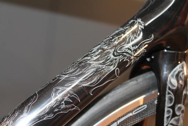
The frame and fork have been decorated with original tattoo-inspired designs, etched by hand using a fine needle.

The parts used here all began as Token components, but they were all then refined or reshaped by hand and then polished up. None of the parts have been anodized, painted or treated.

You can see, for example, that those are Token’s Shark Tail Skewers but they’ve been reshaped and the graphics have been removed. It’s a similar deal with Token’s Heggset headset, 3D spacers and Diamond top cap.

The Carbon Offset seatpost has been etched with quotations over a marble-effect base.

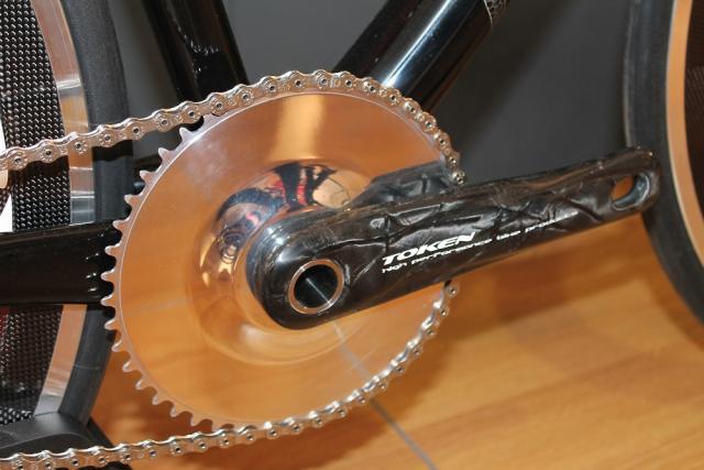
The cranks and chainring were made especially for this bike.
The wheels are Token’s new Hero C45A clinchers that we told you about recently, with fixed gear spacers created exclusively for this bike across the freehub. Token do call the Rebel a fixie but it has standard dropouts and whether that freehub still works as a freehub, we’re not sure. The bike has no brakes so either it is a fixed gear or you're going to go through the soles of your shoes pretty fast... or, most likely, it's just a display model that'll never actually be ridden.
The Rebel is a show-only bike; it’s not available for sale.
Mat has been in cycling media since 1996, on titles including BikeRadar, Total Bike, Total Mountain Bike, What Mountain Bike and Mountain Biking UK, and he has been editor of 220 Triathlon and Cycling Plus. Mat has been road.cc technical editor for over a decade, testing bikes, fettling the latest kit, and trying out the most up-to-the-minute clothing. He has won his category in Ironman UK 70.3 and finished on the podium in both marathons he has run. Mat is a Cambridge graduate who did a post-grad in magazine journalism, and he is a winner of the Cycling Media Award for Specialist Online Writer. Now over 50, he's riding road and gravel bikes most days for fun and fitness rather than training for competitions.
Latest Comments
- eburtthebike 1 hour 11 min ago
If only new road schemes attracted such vociferous opposition....
- David9694 1 hour 15 min ago
Ashford residents say roadworks are plaguing town with closures on Kennington Road (A2070), Newtown Road, and more...
- chrisonabike 1 hour 40 min ago
Good news on the destructive testing - angle grinder brute force is how I lost a bike. Obviously I implicitly trust manufacturers' publicity...
- Offwood 2 hours 3 min ago
Absolutely. Or even a relative of the victim. In so many of these cases there is no justice.
- David9694 1 hour 41 min ago
Car crashes outside Poundland in Abingdon town centre...
- dubwise 12 hours 42 min ago
So cyclists will be punished far heavier than killer drivers. Sums up the fkd up UK.
- HLaB 12 hours 55 min ago
I've done the 312 and other closed roads events like the Etape Caledonia and each time there is bad press like this in advance but on the day the...
- Pub bike 13 hours 11 min ago
Spiral wound cables can expand and contract and possibly help with brake modulation, as well as make tighter bends. ...
- Burnsy Bhoy 14 hours 32 min ago
My TL200 rear light stopped working after 14 months - it seems IP ratings arent what they say on the tin! I have tried different brands and all...
- OnYerBike 20 hours 43 min ago
I've no idea what the situation is here, but I've seen plenty of "under construction" cycle lanes where there are only signs/barriers around the...


Add new comment
6 comments
I'm glad I'm not the only one who thinks it looks crap!
What a lousy advert for Token, whoever they may be!
Agree with all the above. Looks like a total disaster to me.
Do you think it was the boss's son's school project?
gackk
What they said - why go to all this fuss on a bike, only to mis-match components? If it's a "show-only", bike, it's going to get looked at. And people will notice the bits that won't work. Even a half-link would have made that chain look better. And fixed-wheel and quick-release?
Incidentally, I think that's one of the ugliest bikes I've ever seen...
< /gripe >
Who the hell goes out to make a one off custom made bike like this to then not put track dropouts on?
Which I guess explains the woefully slack chain.
Fun bike tho'. If you're a hipster.