- News
- Reviews
- Bikes
- Accessories
- Accessories - misc
- Computer mounts
- Bags
- Bar ends
- Bike bags & cases
- Bottle cages
- Bottles
- Cameras
- Car racks
- Child seats
- Computers
- Glasses
- GPS units
- Helmets
- Lights - front
- Lights - rear
- Lights - sets
- Locks
- Mirrors
- Mudguards
- Racks
- Pumps & CO2 inflators
- Puncture kits
- Reflectives
- Smart watches
- Stands and racks
- Trailers
- Clothing
- Components
- Bar tape & grips
- Bottom brackets
- Brake & gear cables
- Brake & STI levers
- Brake pads & spares
- Brakes
- Cassettes & freewheels
- Chains
- Chainsets & chainrings
- Derailleurs - front
- Derailleurs - rear
- Forks
- Gear levers & shifters
- Groupsets
- Handlebars & extensions
- Headsets
- Hubs
- Inner tubes
- Pedals
- Quick releases & skewers
- Saddles
- Seatposts
- Stems
- Wheels
- Tyres
- Health, fitness and nutrition
- Tools and workshop
- Miscellaneous
- Cross country mountain bikes
- Tubeless valves
- Buyers Guides
- Features
- Forum
- Recommends
- Podcast
TECH NEWS
 scott addict
Scott unveil new colours and designs for their road bike range
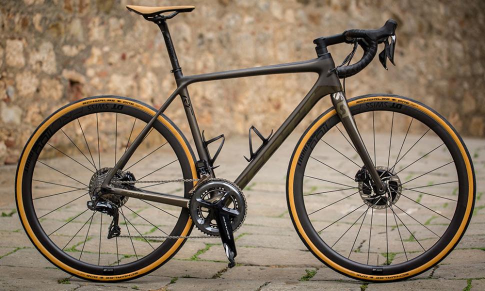
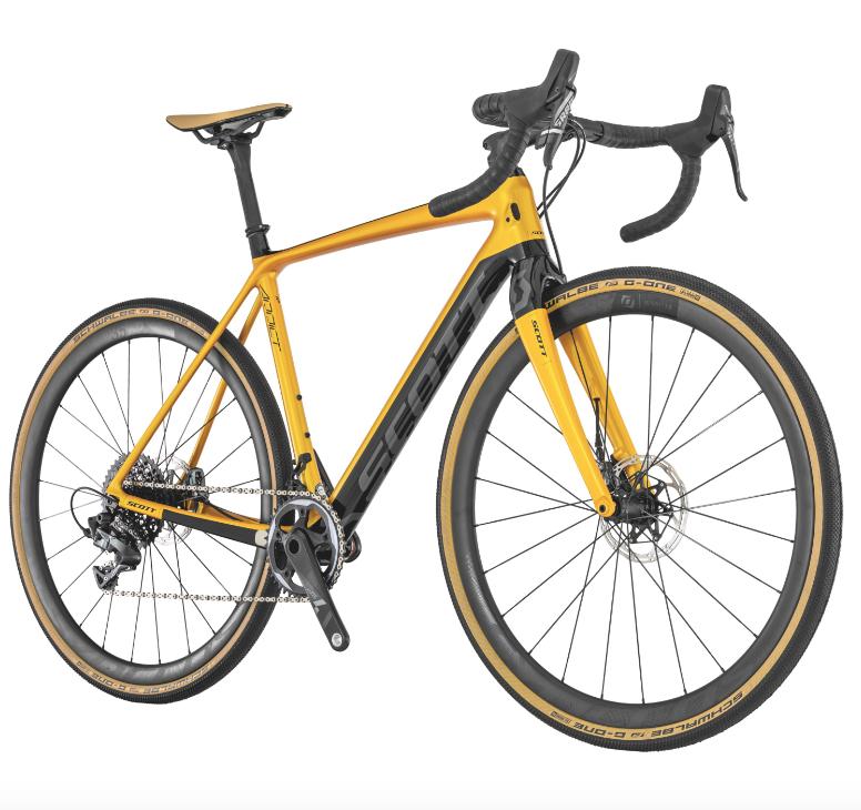
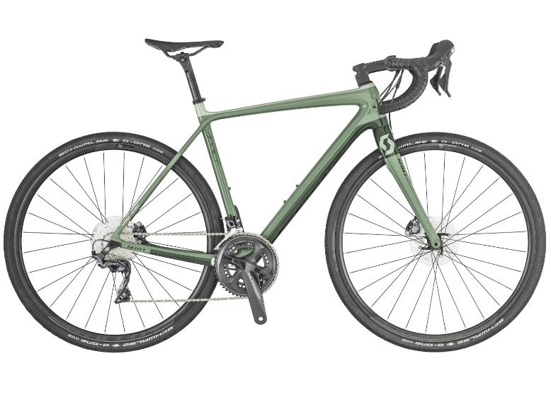
Scott have unveiled some brand new looks for their 2019 road bike range, with the aim to make the designs and colours "more lifestyle-focused".
12 of the best carbon fibre road bikes
Neymar presented with custom Scott Foil Disc
The new designs are inspired by the high-end car industry, using deeper, metallic and shiny colours. This was to give them a "more valuable" look, so say Scott... perhaps not what every owner of a high-end bike wants to hear if they wish to deter thieves, but beneficial if you have somewhere super safe to store it. Scott also hope to target a new breed of customer with the fashionable features, including tan-brown leather Syncros saddles and skin-wall tyres.
The bikes available with fresh paint jobs are the Addict RC Premium Disc, Foil 10 Disc, Addict Gravel 10 and the Contessa Addict Disc - head over to Scott's website to see them in more detail.
Jack has been writing about cycling and multisport for over a decade, arriving at road.cc via 220 Triathlon Magazine in 2017. He worked across all areas of the website including tech, news and video, and also contributed to eBikeTips before being named Editor of road.cc in 2021 (much to his surprise). Jack has been hooked on cycling since his student days, and currently has a Trek 1.2 for winter riding, a beloved Bickerton folding bike for getting around town and an extra beloved custom Ridley Helium SLX for fantasising about going fast in his stable. Jack has never won a bike race, but does have a master's degree in print journalism and two Guinness World Records for pogo sticking (it's a long story).
Latest Comments
- open_roads 45 min 30 sec ago
Push them off the motorbike and hopefully they'll both have broken wrists from the fall. I would have thrown the bike up and over the hedge.
- cmedred 1 hour 34 min ago
Lost control of his car doing 40 mph through a 60 mph corner? Sort of begs for some questions as to how Wan obtained a license to drive in the...
- quiff 1 hour 41 min ago
I do understand that policing resources are limited and need to be prioritised, but do we really have to wait until a KSI before they take action?...
- andystow 2 hours 21 min ago
Still no mention of a driver....
- Rian_constant 2 hours 57 min ago
Wow what a joke this article and test is.Should we be surprised a bike with slimmer handlebars can keep up with a modern bike with wide bars and...
- Sredlums 4 hours 2 min ago
Yes, there's a pedal on one side counteracting what you do on the other, so you'd say that evens each other out....
- brooksby 5 hours 2 min ago
Electric car smashed up with 'big pole' in protest against Elon Musk (Bristol Post)...
- chrisonabike 5 hours 7 min ago
Just harness it. In European countries selfish and arrogant people are demanding better cycling facilities (for their convenience) and probably...
- chrisonabike 5 hours 11 min ago
What's perhaps notable is - once I thought about it - I found that every single bike trip around Edinburgh would encounter some kind of "works". ...


Add new comment
6 comments
Trends come and go. Basic single colours, minimalistic or bold but simple logos/lettering and simple frame design are always in.
Amazing it’s taken the mainstream bike industry 30 years to figure out that bikes don’t require ugly stickers and stripes and multi-color tones. You don’t see the car industry doing that so where did it all come from circa 1988?
The latest from the likes of specialized, trek, Kona, etc are looking tasteful indeed.
Because for the most part the car industry brands are pretty established and the manufacturers try their best to ensure their own cars have distinguishing designs to make them recognizable.
Having said that, while cars don't generally have branding stickers everywhere, the manufacturers badges suddenly increased in size 15 years or so ago - compare a Ford badge from an old Sierra with that from a current Focus.
Bikes however all look very similar, with far fewer options to distinguish the a brand in the design of the bike, leaving only the paint to inform people of what brand they are looking at.
It takes a confident bike brand to make their decals more subtle - something that until recently tended to be the smaller niche manufacturers, which is perhaps a bit strange, but then the subtle aesthetic was often one of their big selling points.
I think you’ll find that custom respray companies like Fat Creations and Kustomflow have 12 month plus waiting lists because a hell of a lot of riders don’t want a bike that looks bland these days. Bright colours and logos are in high demand now. Bland and black is dead and manufacturers are starting to shift away at last. Looks like Scott are a wee bit behind the times now.
These are lovely
Really love those gumwall tyres. Funny how things come around if you wait long enough...