- News
- Reviews
- Bikes
- Accessories
- Accessories - misc
- Computer mounts
- Bags
- Bar ends
- Bike bags & cases
- Bottle cages
- Bottles
- Cameras
- Car racks
- Child seats
- Computers
- Glasses
- GPS units
- Helmets
- Lights - front
- Lights - rear
- Lights - sets
- Locks
- Mirrors
- Mudguards
- Racks
- Pumps & CO2 inflators
- Puncture kits
- Reflectives
- Smart watches
- Stands and racks
- Trailers
- Clothing
- Components
- Bar tape & grips
- Bottom brackets
- Brake & gear cables
- Brake & STI levers
- Brake pads & spares
- Brakes
- Cassettes & freewheels
- Chains
- Chainsets & chainrings
- Derailleurs - front
- Derailleurs - rear
- Forks
- Gear levers & shifters
- Groupsets
- Handlebars & extensions
- Headsets
- Hubs
- Inner tubes
- Pedals
- Quick releases & skewers
- Saddles
- Seatposts
- Stems
- Wheels
- Tyres
- Health, fitness and nutrition
- Tools and workshop
- Miscellaneous
- Cross country mountain bikes
- Tubeless valves
- Buyers Guides
- Features
- Forum
- Recommends
- Podcast
review
 2022 Mio Cyclo Discover Pal GPS Cycle Computer - 1.jpg
£349.99
VERDICT:
Solid hardware wasted by poor software design – for exploring the unknown, this is not your pal
Big, bright touchscreen
Clear mapping
Mostly good directions
Takes 35s to start up
Can be unintuitive to control
No out-front mount included
Won't reroute if you go wrong
Full of niggling annoyances
Weight:
136g
Contact:
At road.cc every product is thoroughly tested for as long as it takes to get a proper insight into how well it works. Our reviewers are experienced cyclists that we trust to be objective. While we strive to ensure that opinions expressed are backed up by facts, reviews are by their nature an informed opinion, not a definitive verdict. We don't intentionally try to break anything (except locks) but we do try to look for weak points in any design. The overall score is not just an average of the other scores: it reflects both a product's function and value – with value determined by how a product compares with items of similar spec, quality, and price.
What the road.cc scores meanGood scores are more common than bad, because fortunately good products are more common than bad.
- Exceptional
- Excellent
- Very Good
- Good
- Quite good
- Average
- Not so good
- Poor
- Bad
- Appalling
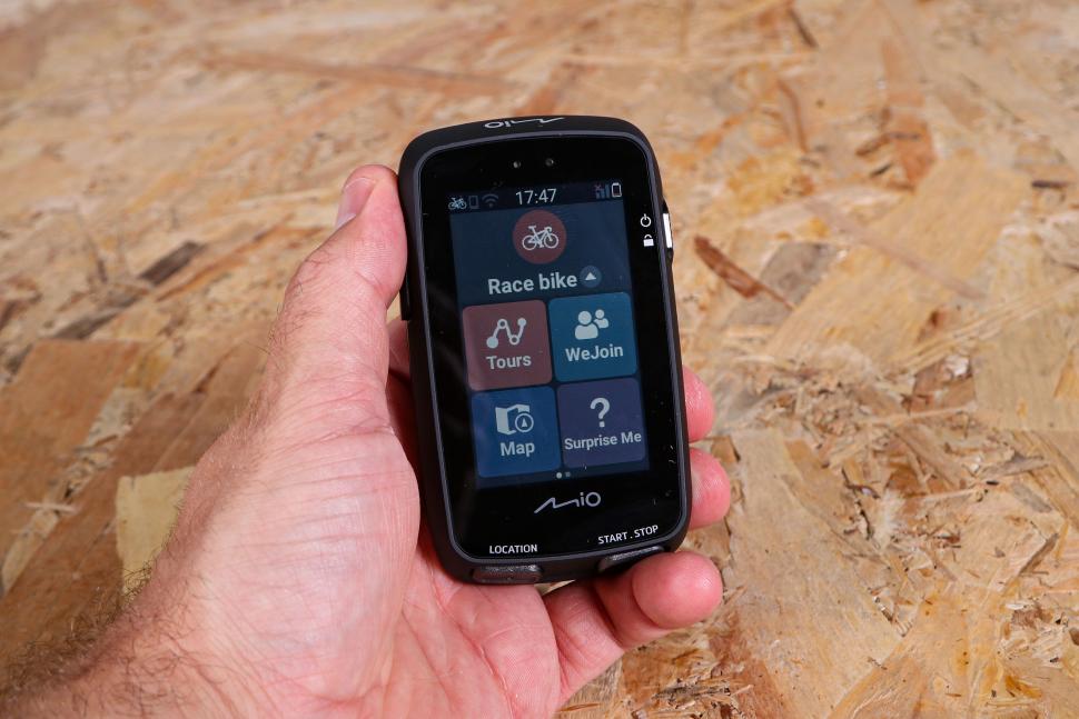
The Mio Cyclo Discover Pal has a big, bright touchscreen with maps that are easy to read and control – even in gloves and rain – yet it can be incredibly frustrating to use. If you're after detailed metrics, sensor connectivity and accurate measurement, as you tend to get with the best cycling computers, be grateful it's not aimed at you and doesn't have them, because it's casual and leisure cyclists looking for easy navigation who'll be struggling with it instead.
> Buy now: Mio Cyclo Discover Pal for £329.99 from RAC Shop
So here's how my first ride relying on this for navigation went, and seeing as I'd just moved to a new area, I really was relying on it.
Imagine me speeding downhill to a junction in the rain and looking down to see which way to turn, and finding the entire screen filled with a QR code yet again, and stabbing at the bloody thing while trying to brake again, and missing what I eventually find is my turning because of it, and deciding the 'Discover' part of the name here involves discovering just how very many swear words I know.
Now rewind a couple of hours.
Like most gadgets, the Cyclo Discover Pal wants to do pretty much everything, though thankfully it's not trying to be yet another social media platform – though it will happily connect to things, such as Strava, that are. Mainly it focuses on navigation, but even then it would like to drag in other people via the MioShare App.
I'm quite grumpy and don't like meeting other people when dressed like this, but apparently many people do. Socialites can lead a ride with the WeJoin feature – and just a single unit between you – if everyone else has the app on their phones. Doing so allows you to share the route and see each other's locations, though good luck; I hope your friendships are strong.
I found even pairing the Cyclo with my own phone slightly faffy, as it looks simple but seems to involve codes and poking various parts of both screens at just the right time. It took a few goes, with me wondering if it was working or not. Once successfully done, at least, it connects automatically (and rapidly) from then on.
Resolutely routey
How do you choose a route? Let me count the ways. Actually no, there are loads: you can link with Mio's app, Komoot, RouteYou or Strava Route; press 'Surprise Me' and choose from various critera (such as Loop, Point of Interest or a stored favourite); select co-ordinates on the map and have it navigate you there; or just go crazy and have somewhere you want to go, then go there.
Oddly, there's no way to create anything other than a random route either via the device itself or the app (you set the distance and it will suggest three). You can import .gpx files, though, which is more useful. Though I use Strava I thought RouteYou, which also gets a big button on this Mio, seemed more fitting for the casual cyclist. So I gave that a try.
> GPS cycle route planning made easy – how to plan and follow a bike route
It's free and easy to use, and while it too only does auto-generated routes (choose the distance and style and let it build one), it will output them as .gpx files and you can download any .gpx at all via the Mio app. After some confusing faff making my new local route actually appear on my device, I couldn't help wondering why I didn't just press the inviting 'go' and use RouteYou on my phone... £350 would buy a lot of bar mounts and waterproof cases, after all.
Never say never
This is where I need to introduce you to NeverMiss, which gets a TM and everything, but – if you go looking for it – is nowhere to be seen, despite allegedly turning this into 'A cycling notebook in your pocket'.
It's basically a landmark-tagging feature and is buried inside the Routes feature, assuming you've planned that route either in Mio's app or by RouteYou, and further assuming you've set the points of interest you want to see before you left... and even more further assuming you're happy to drag out your phone when the notification pops up, and THAT, as I said, is a massive QR code that fills the screen and stops you navigating until you cancel it.
The idea is that you (presumably) stop, pull your phone out, take a picture of the QR code, hope you've got a phone signal, and then look at the link it's taken you to for information.
It's a damn sight easier just to remember it, quite frankly. Or to google it yourself. Ironically you'd probably NeverMissTM the entire feature, although if you're like me you will RepeatedlyMissTM your turnings because of it. A split screen between QR code and navigation would be infinitely preferable, or better still an expandable QR notification. Happily you can turn off any unwanted landmark notifications in the RouteYou app, but I didn't notice the first time and got them all.
There's a lot of technology involved here for the audience of casual, touring cyclists, and you're relying quite heavily on your phone and other services you must link. The 35-second startup time is unlikely to please anyone, either, though the battery life – an hour's use doesn't make a visible dent in the meter, and you can ride all week with it (Mio claims up to 17 hours per charge) – is at least a lot more suitable.
Are we nearly there yet?
Under navigation the unit beeps once and then twice to alert you to upcoming turnings. Turn symbols and instructions pop up at the top, and while they're mostly clear they don't always agree perfectly with each other; a slight right over a crossroads, for instance, can be accompanied by a more-than-90-degree turn symbol that implies a hard right instead.
I found route mileages were routinely short in the POI list, but clicking on any individual route brought up the correct mileage. The list says my nearest pub is 1.6 miles away, for instance, but if you click on it it says it's 2.3. Which it is.
Also, in Surprise Me I'd select, say, 20 miles as my desired loop and it would suggest three up to 20km instead. And one such route displayed correctly but said I had 270 miles to go, which to be fair did surprise me, because I was already home. Perhaps a future update will fix these things.
Just do as you’re told
You'd better not completely miss any turnings, either, because the Discover Pal absolutely will not recalculate anything.
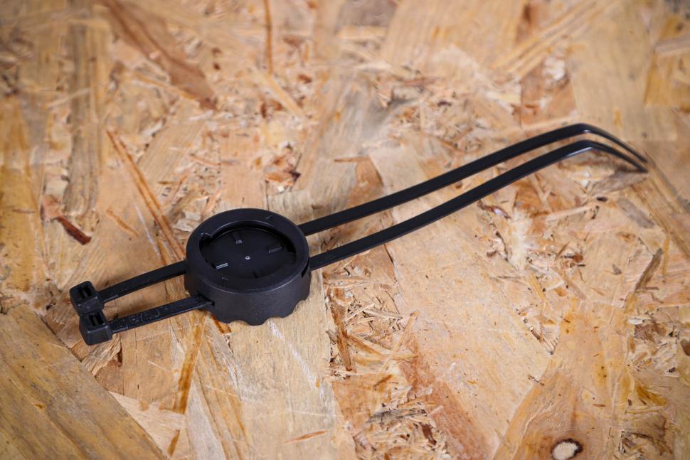
Having finally got a route in the thing and zip-tied the mount to my stem – there's no out-front mount included, which is disappointing at this price
– I pressed the little forward-arrow 'play' button, which looked likely, and also the tick button next to it, which also looked likely. Then on the next screen I pressed the 'Go' button because... well, guess. Despite this, after perhaps 30 seconds I got a message about movement being detected, and did I want to record? Yes.
One of these four 'yes, start' options was wrong, however, and after about half a mile I realised it was no longer directing me anywhere. So I reset the saved route and it made me turn round, ride back up the hill to my house, then turn round again and come back. Great.
You can stray off the route and get back on and the Discover Pal will still try to make you go back to the checkpoint you originally missed. Again, this seems poorly suited to its audience, especially when free apps such as Google maps will constantly reroute you.
Later in my exploratory ride I stopped for an oncoming van that was filling the road, set off again and got another 'movement detected – do you want to record?' message. Fearing I'd just be sent back the way I came to the start point by its inflexible programming, I left it alone. Making that mistake miles into a long ride would be incredibly irritating.
Close enough for jazz
It also routinely reads 1mph lower than my other devices (which agree with each other, at least), and the figure is noticeably slow to refresh. Also sluggish are the junction calls when you're on a fast road – more than once I felt unsafe turning right from a main road as I was almost on top of it when the note came, leaving no real time for checking traffic, indicating and getting positioned.
It's a node from me
If you're in the UK you can ignore the Node Network option completely, as that only operates in the Netherlands, Belgium, Germany and France. In fact, the focus is very European in general – the app continually recommended walks for me in the Hague, even after I'd set my home location as Wales and my favoured activity as road cycling.
Slightly confusingly, the app's main page kept recommending the Hague while showing me at my old address in Powys, instead of where I was – I moved house halfway through the test, and like my cat it seemed rather unwilling to accept it. On the upside, the Mio Cyclo has not bitten me yet.
Synching feeling
So you actually manage a ride and want to see it in the app. You might expect that pairing your phone with the GPS via Bluetooth and refreshing the activities list would work. But no. Instead you have to go to Settings, and then Connections, and then Wifi (even though you're also connected by Bluetooth) and then finally find a big red 'Synch' button. Only then will your paired devices update each other.
It doesn't seem like there are many MioShare users in the UK; the nearest 'tour' to my location saved by anyone else was in Glasgow, and if I filtered for 'race bike' activities there were none in the entire country.
Mio also trumpets a 'Where am I?' feature for safety, but again there's no obvious button for that anywhere. Instead, if you press 'Map' it just says 'Where am I?' at the top for a few seconds as it gives the coordinates. Fine, once you realise how to see it, but it's not the most obvious thing in an emergency. And no, Mio, I'm still not in the Hague.
More obvious, and potentially very useful, is the POI tile. Here you can see nearby locations in useful categories – emergency, bike store or food and drink – and it's pretty accurate. Handy in a pinch.
Finally, if you're already somewhere you want to mark for future navigation, a quick press of the big Location button on the unit's base will save it.
Soft machine
While the software on this thing is sub-par, the unit itself is pretty good. The screen is big, bright and easy to read, and the big tiles respond well to touch, even in (appropriate) gloves and/or rain. While sometimes the screen doesn't respond at all, that's actually because it's quietly locked itself; a press of the top button unlocks it. The first time it stopped responding I assumed it was the rain or my old gloves, ended up stabbing at everything trying to get a response, and almost knocked it off the mount while pressing the power button – pushing hard there will twist the unit.
Again, I blame the software, as the screen lock status notifications are tiny and brief – all three buttons only need light presses if you're not confused and irritated.
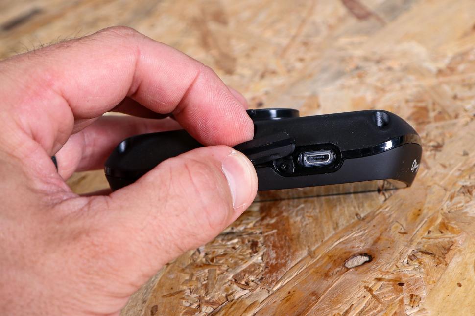
The only issue I had with the physical device was the hard plastic (rather than silicone) charging port cover, which needs a really firm shove to engage and seal. Push it too gently and it slowly slides back out.
Value
At £349.99 this is exactly the same price as the Garmin Edge 830. The Edge's design might be three years old now, but that means a) it's available on some great deals and b) the software is now extremely well sorted out. Plus, alongside mapping and navigation it has all manner of measurements, ANT+ connectivity and support for training plans, workouts and much more. We reviewed one earlier this year.
If you'd rather stick to navigation and want to keep it simple, the Beeline Velo 2 did very well in our review as it's small, light and very intuitive, and it only costs £99.99 – though it's not giving you actual maps.
Alternatively, the Bryton Rider 420E is a more regular shape and size and has mapping (though it's basic), and is very effective for its £134.99 rrp (at the time of writing, Bryton was actually selling it for £99.99). Stu reviewed it a couple of years ago and was impressed.
Basically, given the often frustrating controls and inflexible navigation, it's hard to say this feels like good value.
Overall
The Discover Pal feels like a pretty nicely made device with underwhelming software that spoils it – and presumably only more so for its 'casual' intended audience than for determined riders. The screen and buttons are good, and it clearly has the power to be a solid navigation aid. As it is, though, it's often frustrating to use, sometimes confusing, and annoyingly inflexible should you stray from the prescribed route.
Verdict
Solid hardware wasted by poor software design – for exploring the unknown, this is not your pal
road.cc test report
Make and model: Mio Cyclo Discover Pal GPS Cycle Computer
Size tested: Screen size 2.8in
Tell us what the product is for and who it's aimed at. What do the manufacturers say about it? How does that compare to your own feelings about it?
Mio doesn't say much more than 'Enjoy the ride together!' before just diving into the specs and features. It's a navigation device aimed at exploration and group riding.
Tell us some more about the technical aspects of the product?
Mio lists:
GPS Chipset U-blox 7
Touchscreen
Color Display (sunlight readable)
Display Resolution 240X400
Display Size 2.8"
Width (mm) 58
Height (mm) 100
Depth (mm) 22
Weight (gr) 133
Memory 16 GB
Battery up to 17h
Buzzer Instructions
Light Sensor
IP Rating (Waterproof) IPX7
WIFI
Bluetooth 4.2
Barometric Altitude
SoftwareCustomizable Dashboard
WeJoin™
NeverMiss™
Mark Place with Recording Data Upload to MioShare™
Detailed History
BIKE POI-LIST
Surprise Me™ Loop
Surprise Me™ A to B
Importing Tracks
Komoot Tracks
RouteYou Tracks
STRAVA Route (STRAVA Premium account)
Shimano STEPS
* Shimano STEPS series supported: SC-E6100 / SC-E7000 / SC-EM800 / EW-EN100.
Save Favorite Location
Map with Elevation
Where Am I Function
Strava Upload
Turn-by-Turn to Track Start Point
Voice Guidance (by smartphone App)
Block Roads For Detour
Fitness Function
Incoming Message Alert
Incoming Call Alert
Wireless Data Sync
Maps Pre-installed
Node Option(knooppunten) (Node Network)
Climb info
Free Map Updates Lifespan of device (by smartphone App)
OSM
Cloud Service MioShare™
Smartphone App (iOS/Android) MioShare™ App
Rate the product for quality of construction:
9/10
Rate the product for performance:
5/10
Get it working and stay on the prescribed route and it's good.
Rate the product for durability:
9/10
Rate the product for weight (if applicable)
7/10
Rate the product for value:
3/10
Costs the same as far superior devices.
Tell us how the product performed overall when used for its designed purpose
Once you've managed to get everything running smoothly and you're on the right route, it's pretty good. Otherwise, it's frequently awkward.
Tell us what you particularly liked about the product
Big, clear and bright screen with good touch sensitivity.
Tell us what you particularly disliked about the product
How long have you got?
How does the price compare to that of similar products in the market, including ones recently tested on road.cc?
£350 is not unreasonable for its quality and potential, but puts it up there with some very capable competition it just can't match.
Did you enjoy using the product? At times
Would you consider buying the product? Nope
Would you recommend the product to a friend? Nope
Use this box to explain your overall score
It's well made, but average in performance, and overpriced.
About the tester
Age: 48
I usually ride: Vitus Zenium SL VR Disc My best bike is:
I've been riding for: 10-20 years I ride: A few times a week I would class myself as: Experienced
I regularly do the following types of riding: general fitness riding, mtb,
Latest Comments
- Rian_constant 2 sec ago
short sighted by some grumpy locals. Cycling tourism leaves incredible amounts of money with very little environmental impact compared to e.g....
- OnYerBike 2 hours 3 min ago
I've no idea what the situation is here, but I've seen plenty of "under construction" cycle lanes where there are only signs/barriers around the...
- Pub bike 2 hours 5 min ago
I see - Nokon avoids the problem of radial or longitudinal wires altogether using short solid segments that are non-compressible.
- the little onion 2 hours 10 min ago
whereas the whole point is that they didn't hit you this time
- Tom_77 2 hours 24 min ago
AIUI an entering-circulating accident [sic] would be when the vehicle entering the roundabout fails to give way to the vehicle circulating.
- chrisonabike 2 hours 42 min ago
Which is great - but you can only take a bus which exists eg. is going somewhere near where you want to go, when you want to go....
- mdavidford 4 hours 34 min ago
Erm, does someone need counting lessons?
- Willem1 4 hours 45 min ago
My cannondale SuperSix gen3 frameset i recently bougth has a sticker saying: made in China. Dont know about the newest models.
- SimoninSpalding 5 hours 29 min ago
Cos style, and did you not read it only weighs 158g!...
- chrisonabike 5 hours 55 min ago
It's strange - some folks who grew up there say it was a great community and has declined. Some folks say it was "like Beiruit" and has calmed down...




Add new comment
3 comments
I'm really trying to understand the point of this device. I'm pretty sure a very large chunk of its target group would just use their mobile phone and Google Maps, Komoot, etc. for navigation. And the price!!!
I have a few customers with GPS units other than the usual Garhoo's. A couple have Mio and love them and others have Sigma too..... I use a Bryton 750 as do a few others I know..... I can't speak for this unit but these riders are happy with what they have, as I am with my Bryton which has been flawless....the software is a wee bit "clunky" but works well when you get the hang of it. I just get a bit miffed with reviews on any GPS units other than Garhoo's are always poor and no I am not have a knock at Road.cc or the testers but it is always the same. Look at EU cycling sites and reviews and they give more balanced reviews.
Just a few thoughts.... and for the record my Bryton takes me on road, off road, imports from the major route planning and online resources as well as 3rd party route sites(which I favour) and the gps has worked where a cycle pals "G" brand stopped working as to the location..... and it re reoutes etc no problem....I guess the only thing many don't like is the link to the mobile phone while in use, but how many of us cycle without our phones? .... Ride Safe...however you do it
I have the much cheaper Mio cyclo 210 (cost me £130 at the time, I think). I got it because I just wanted a decent GPS unit and didn't care about ANT+ connectivity etc. Strange that you say that this does not reroute as my cheaper model does, very effectively. The "Suprise me" routes, I've found, are pretty good and I have discovered some nice routes with it (plus you can select it to favour quieter routes or off-road routes etc.). Mine also has simpler controls than this. Just one power on button and then touch screen controls, that seems to work well. I also managed to buy a seperate, better quality, out-front mount for a few quid online (bikester) which improves things a fair amount. Maybe it was the lower price point of the more budget model, so having lower expectations, but I find my unit to be pretty good.