- News
- Reviews
- Bikes
- Components
- Bar tape & grips
- Bottom brackets
- Brake & gear cables
- Brake & STI levers
- Brake pads & spares
- Brakes
- Cassettes & freewheels
- Chains
- Chainsets & chainrings
- Derailleurs - front
- Derailleurs - rear
- Forks
- Gear levers & shifters
- Groupsets
- Handlebars & extensions
- Headsets
- Hubs
- Inner tubes
- Pedals
- Quick releases & skewers
- Saddles
- Seatposts
- Stems
- Wheels
- Tyres
- Tubeless valves
- Accessories
- Accessories - misc
- Computer mounts
- Bags
- Bar ends
- Bike bags & cases
- Bottle cages
- Bottles
- Cameras
- Car racks
- Child seats
- Computers
- Glasses
- GPS units
- Helmets
- Lights - front
- Lights - rear
- Lights - sets
- Locks
- Mirrors
- Mudguards
- Racks
- Pumps & CO2 inflators
- Puncture kits
- Reflectives
- Smart watches
- Stands and racks
- Trailers
- Clothing
- Health, fitness and nutrition
- Tools and workshop
- Miscellaneous
- Buyers Guides
- Features
- Forum
- Recommends
- Podcast
news
 Vuelta Trophy.jpg
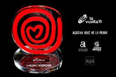
Is it an ice-cream? Is it a lolly? No, it's the new Vuelta a Espana trophy...
The new Vuelta a Espana trophy that will be awarded to the winner of this year’s race has gained a bit more attention than organisers anticipated after Twitter users pointed out its uncanny resemblance to the logo used by consumer goods giant Unilever on its ice cream products throughout the world. It may also seem familiar to anyone in the UK who follows the BBC’s Masterchef programme.
According to the Spanish website Telecino, one tweeter said that for some reason the trophy, designed by Agatha Ruiz de la Prada, made him want to go and buy a Calippo ice lolly, produced by Unilever’s Spanish subsidiary, Frigo, as well as by Wall’s in the UK.
Another tweeted: “Hello Mr Grocer, my name is Alberto Contador. You see, I won the Vuelta and they told me you’d give me a Frigotruño” – the latter word doesn’t translate directly, but appears to be a less-than-complimentary description of products made by Frigo.
The designer herself, said that she had based it on themes such as “wheels, circulation and movement towards the heart.”
Her husband, journalist Pedro J.Ramírez tweeted in the designer’s defence citing a comment made by his wife, who said: “The Frigo logo? I’ve worked for 20 years designing spirals and hearts. They have always inspired me.”
Irrespective of its similarities to the Frigo logo, compared to the blue and gold bowl awarded to the winner of the Tour de France, or the Giro d'Italia's golden spiral "endless trophy," the prize for winning the Vuelta does seem, to us at least, rather uninspriing.
Latest Comments
- Martin1857 8 min 45 sec ago
As a member of the Co-op community (I live in a Housing Co-op) and a bike owner /rider, this is very sad news. We need more Co-ops not less.
- AnotherChrisOnAnotherTrike 9 min 36 sec ago
My EV exceeds the size. It's the smallest vehicle available which can transport my wife's trike (excursions or rescue).
- Dnnnnnn 0 sec ago
It is sad for the individuals concerned but (and this is a general point, rather than specific to this story), we're much better off overall for...
- No Reply 50 min 35 sec ago
I agree with Pogacar regarding social media. The likes of Facebook, Instagram have done untold damage, especially to the minds of young people....
- David9694 55 min 25 sec ago
Lorry carrying 25 tonnes of beer catches fire on the M11...
- No Reply 59 min 57 sec ago
If you're a cyclist on a road you are public enemy number 1.
- Rendel Harris 1 hour 29 min ago
He advocates only riding mountainbikes solely offroad for ultimate safety, which is great if you're a millionaire of leisure living in Colorado...
- ktache 2 hours 23 sec ago
That looks like a fun bike. Frame only, 2 and an 1/2 grand.
- wtjs 2 hours 56 min ago
Fair enough, personal experience may trump (not that one) theory. However, the bonking I have experienced has been due to lack of carbs. Your point...
- Rendel Harris 4 hours 24 min ago
mdavidfrodo?
Add new comment
13 comments
muahaha LoL what a classic!


I fear I may have taken this comments thread slightly off-topic, but I cannot resist adding a link to yet another public relations cock-up.
yeah you have to keep looking at that one… and then you have to stop
My favourite logo EVER is this one
http://video.debacleville.com/images/atherton-car-centre.jpg
I could murder a Funny Foot right now...
Thanks for the OGC logo link, handlebarcam, it is pretty special
Just goes to show that there are no new ideas in marketing (or possibly that "design is stuff with curves in it.")
I'm sure the "artist" who created this doesn't think of it as marketing, but it is. Still, as a piece of corporate design, I've seen worse.
handlebarcam, that OGC logo is a classic! jejeje thanks for sharing! I agree with you all, that new trophy is a shocker! what where they thinking!
Link to the Wall's ice cream logo is the first one in the opening paragraph. There's definitely a similarity (likewise with the Masterchef logo)...
20 years designing spirals... How's that for making a job out of nothing?
It looks like something an eight year old would buy her gran from a tat shop "uninspiring" is the understatement of the year!
Contrast and compare!
http://www.facebook.com/photo.php?fbid=217847798243030&set=t.1797332963&...
I couldn't see your link Aidan but i'm assuming it was something to do with Walls ice cream?